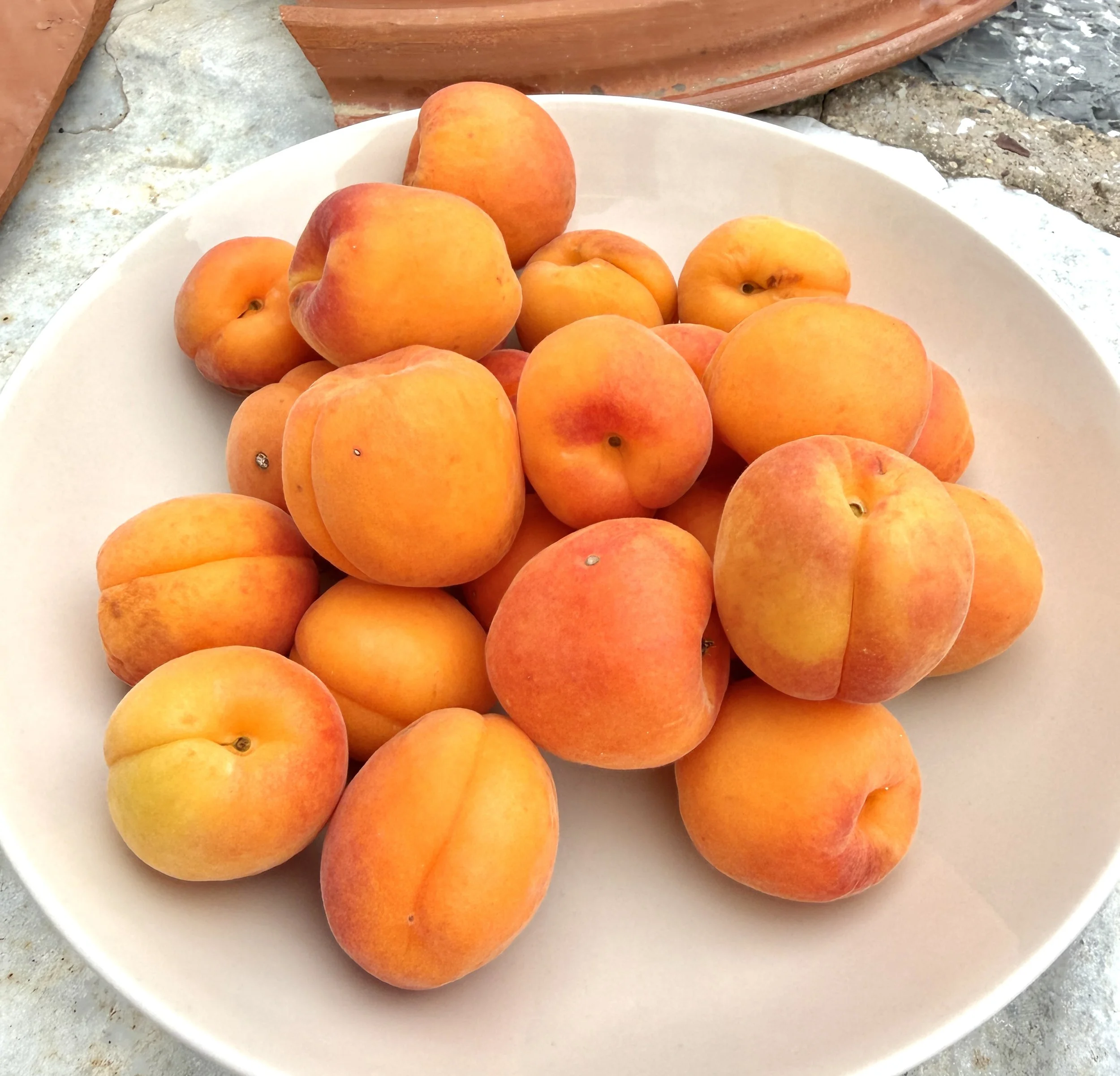
apricot
1. prototypical color
When I use the word “apricot” to describe a color, it’s a peachy hue. A safe color that a bold person may paint a room. But now I see that apricot is many shades of orange. If I were to paint this bowl of fruit, I would take my time mixing colors.
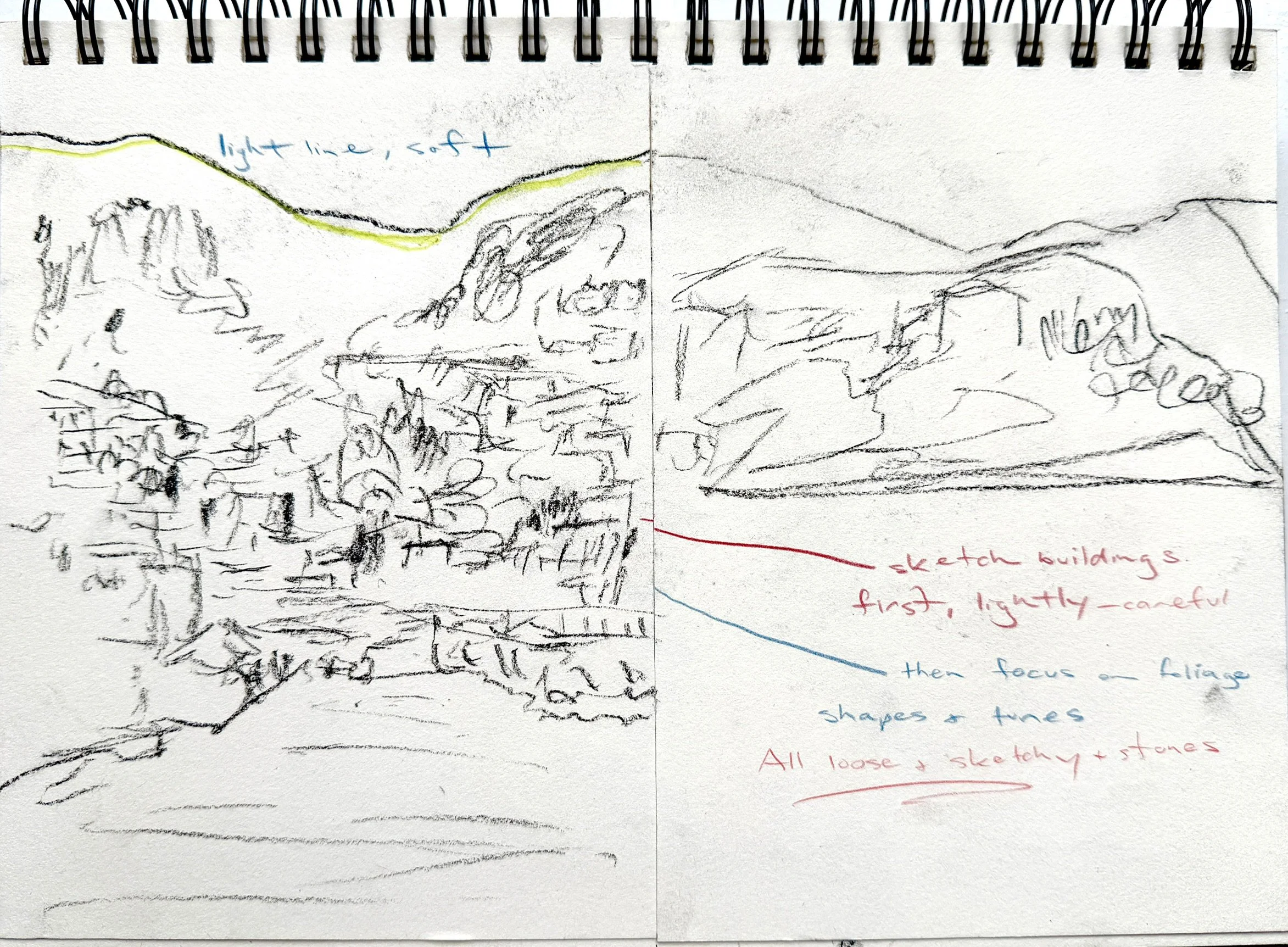
Hydra
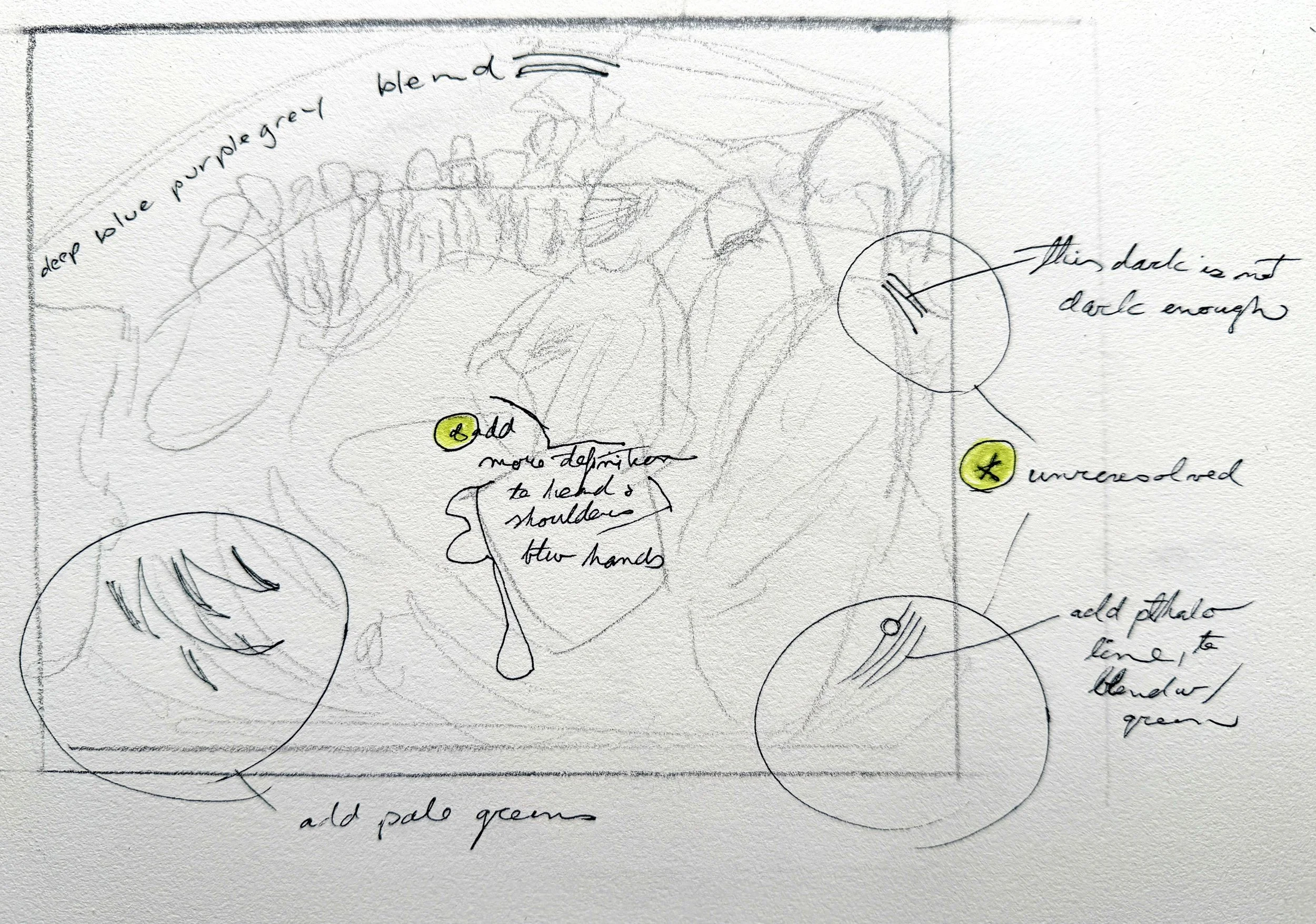
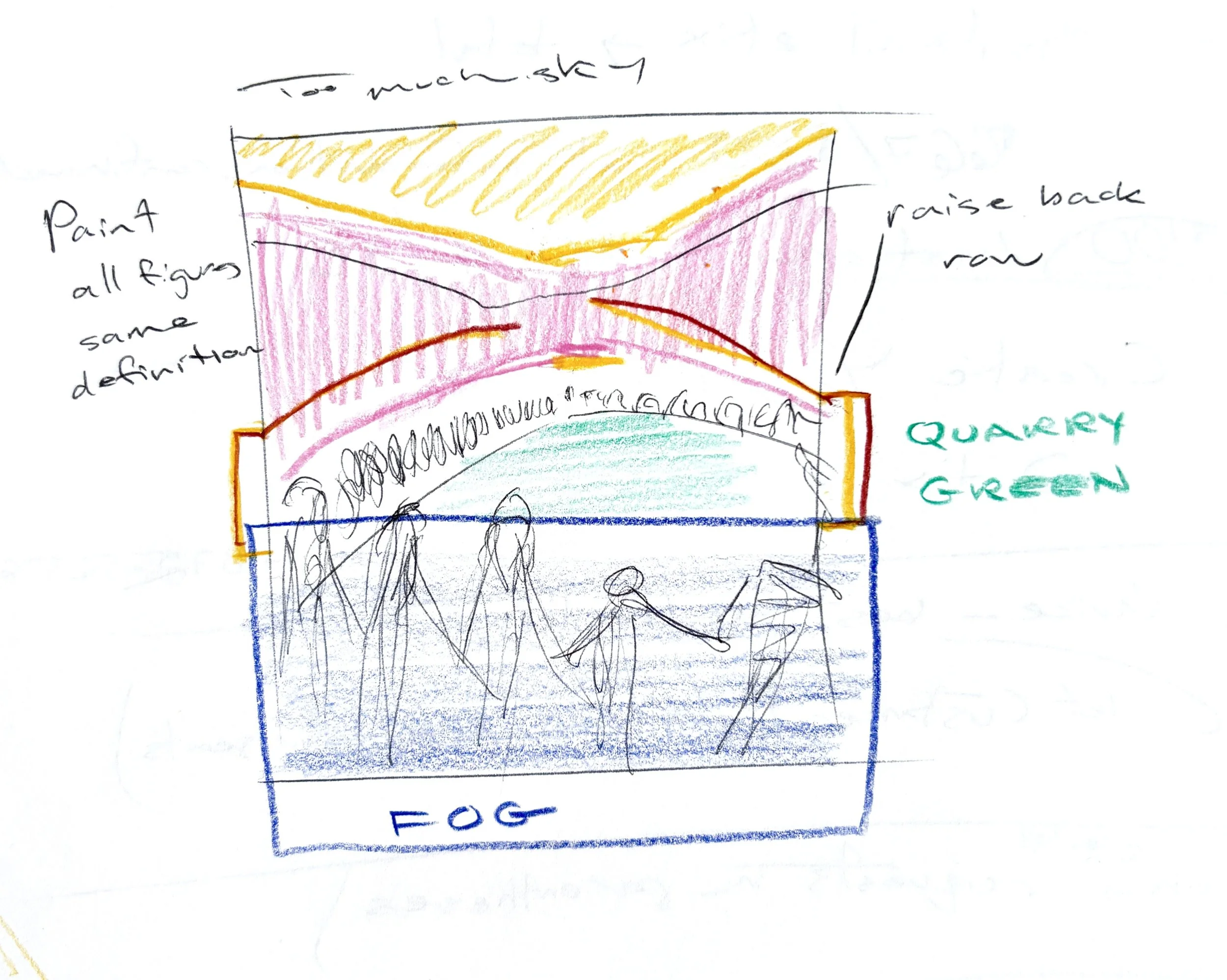
2. compositional study
This study is for the sketch on the left half of the page. The first note is to soften the distant mountain ridges. Next I make note to sketch the buildings first, lightly and carefully. Then, focus on foliage shapes and tones. All loose and sketchy. Lastly I mention stones, that they should be painted in the same free manner.
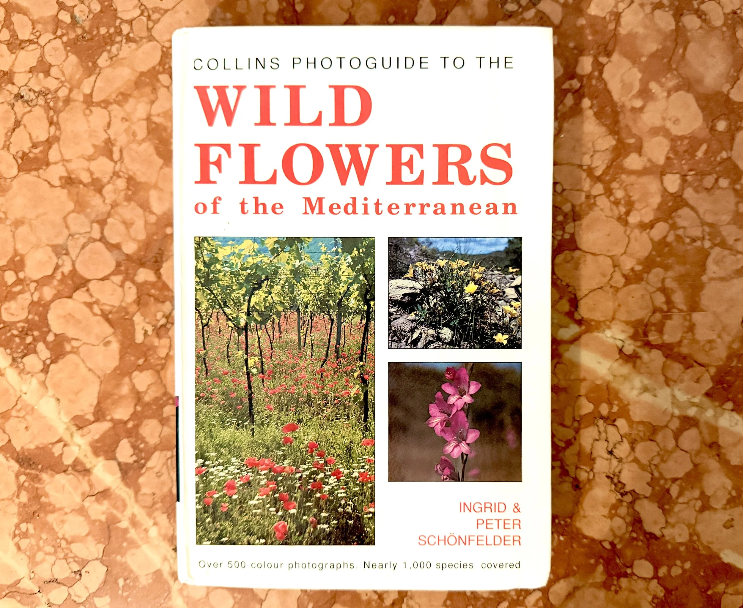
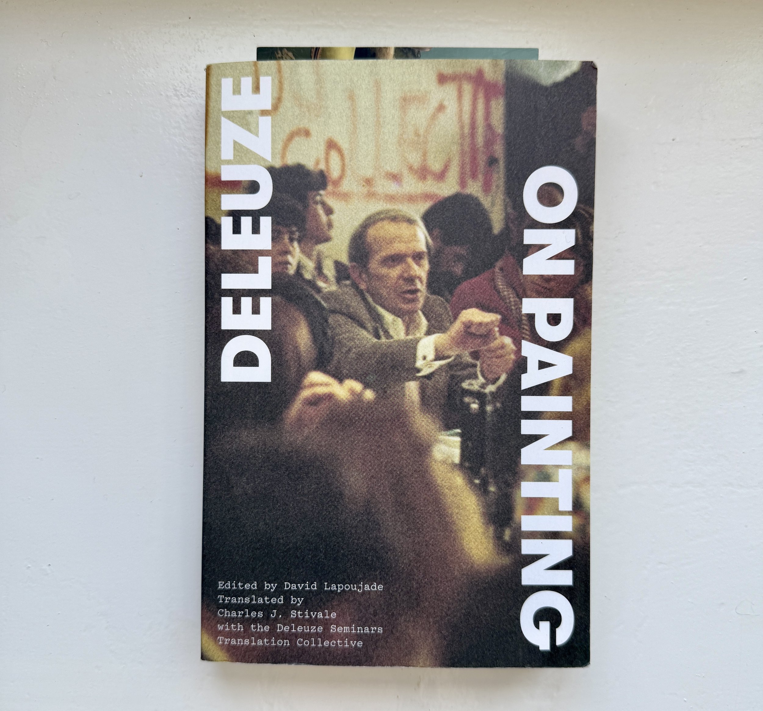
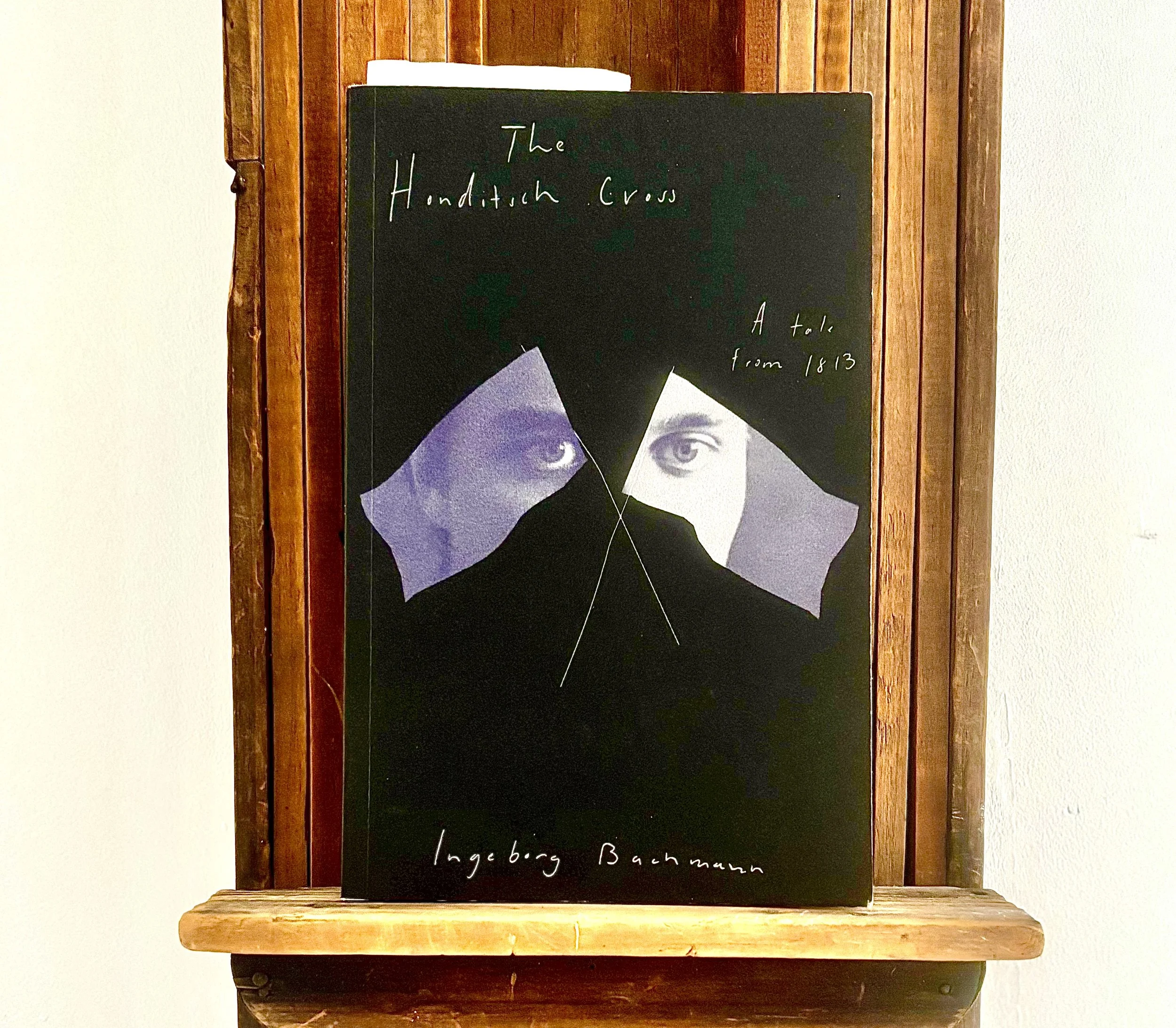
wild flower photoguide
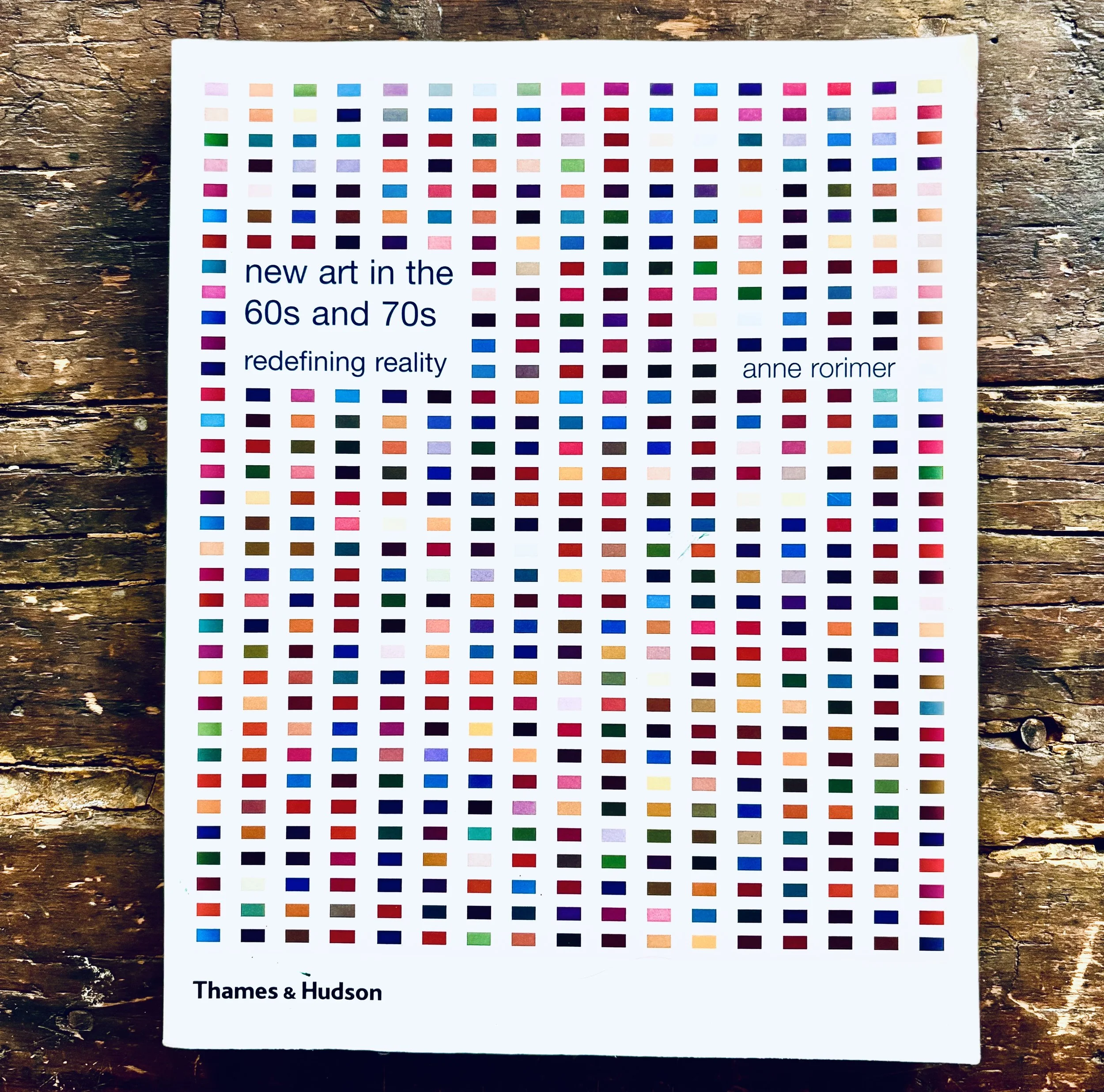
3. on the shelves
Thank you for handing me this book. I have not read it cover to cover, but do keep it by my side.
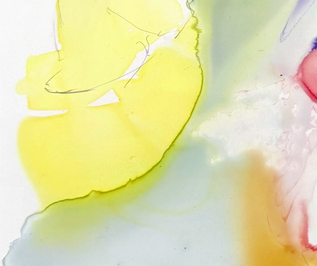
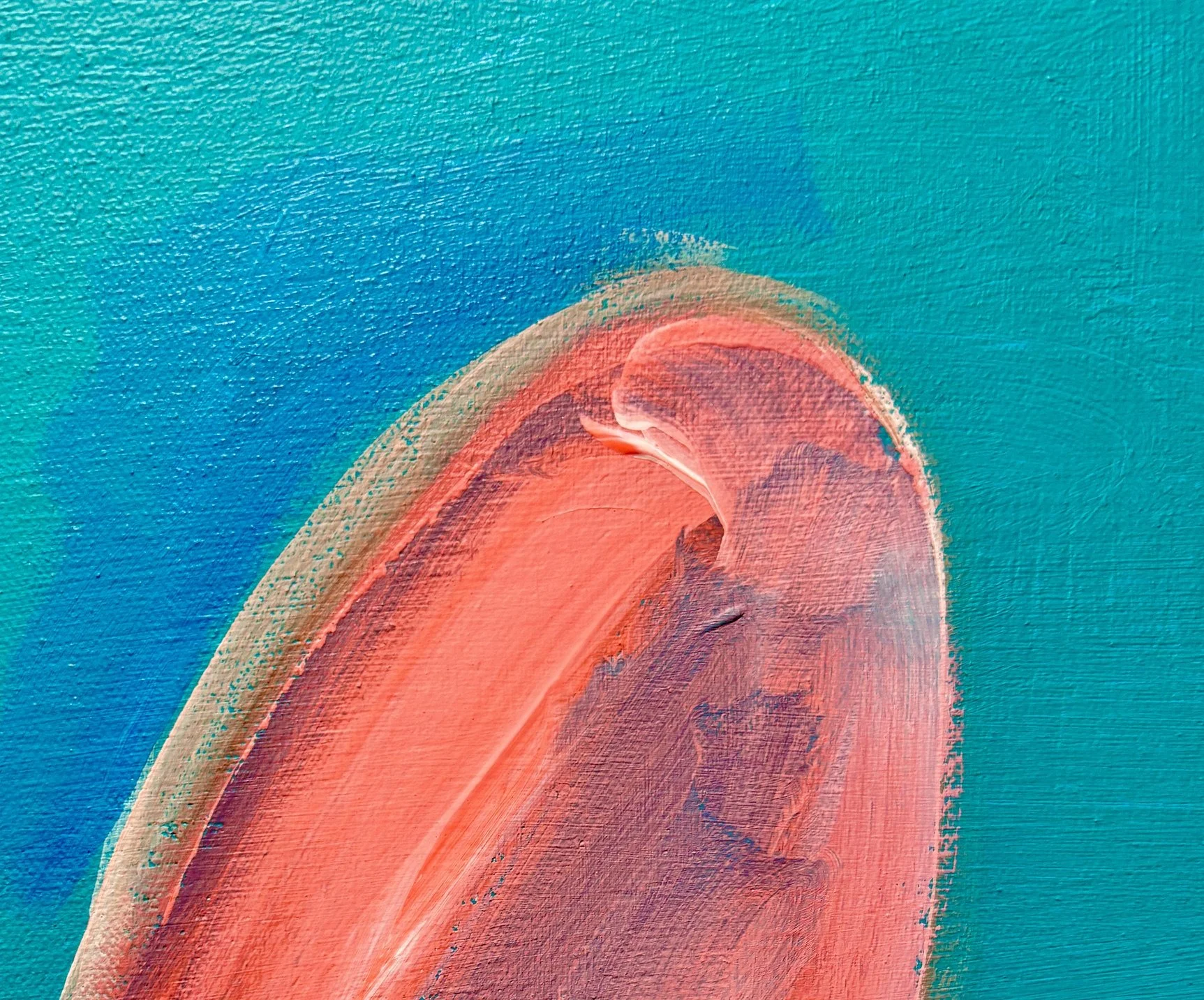
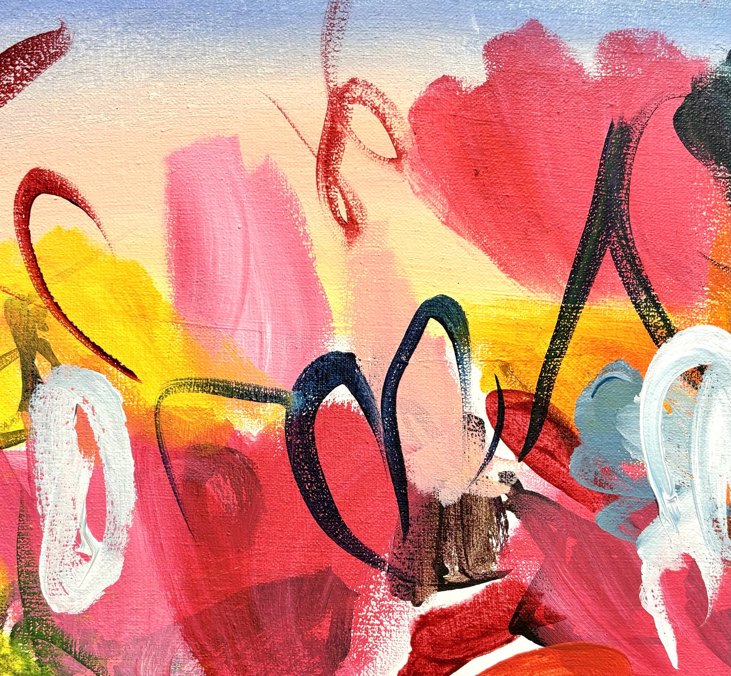
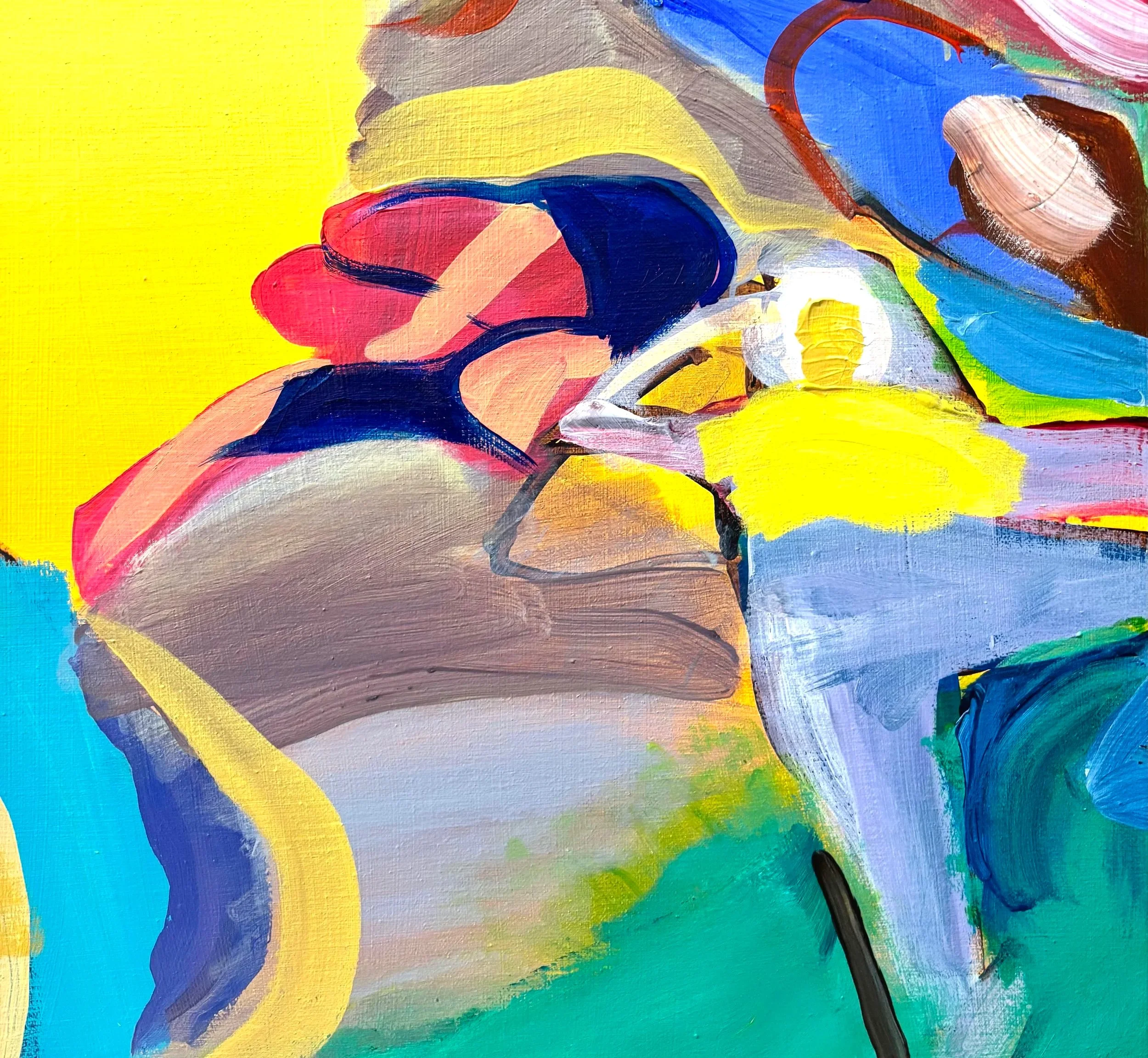
bleeding
4. anatomy of a mark
The mark I am focused on is where the yellow bleeds into the grey along an olive curve. The media is watercolor, which bleeds beautifully, and in this case the substrate has much to do with how this mark occurred. YUPO is a synthetic paper primarily made of polypropylene resin. It is refreshing to not know what will happen on YUPO. Strange marks occur like this one.
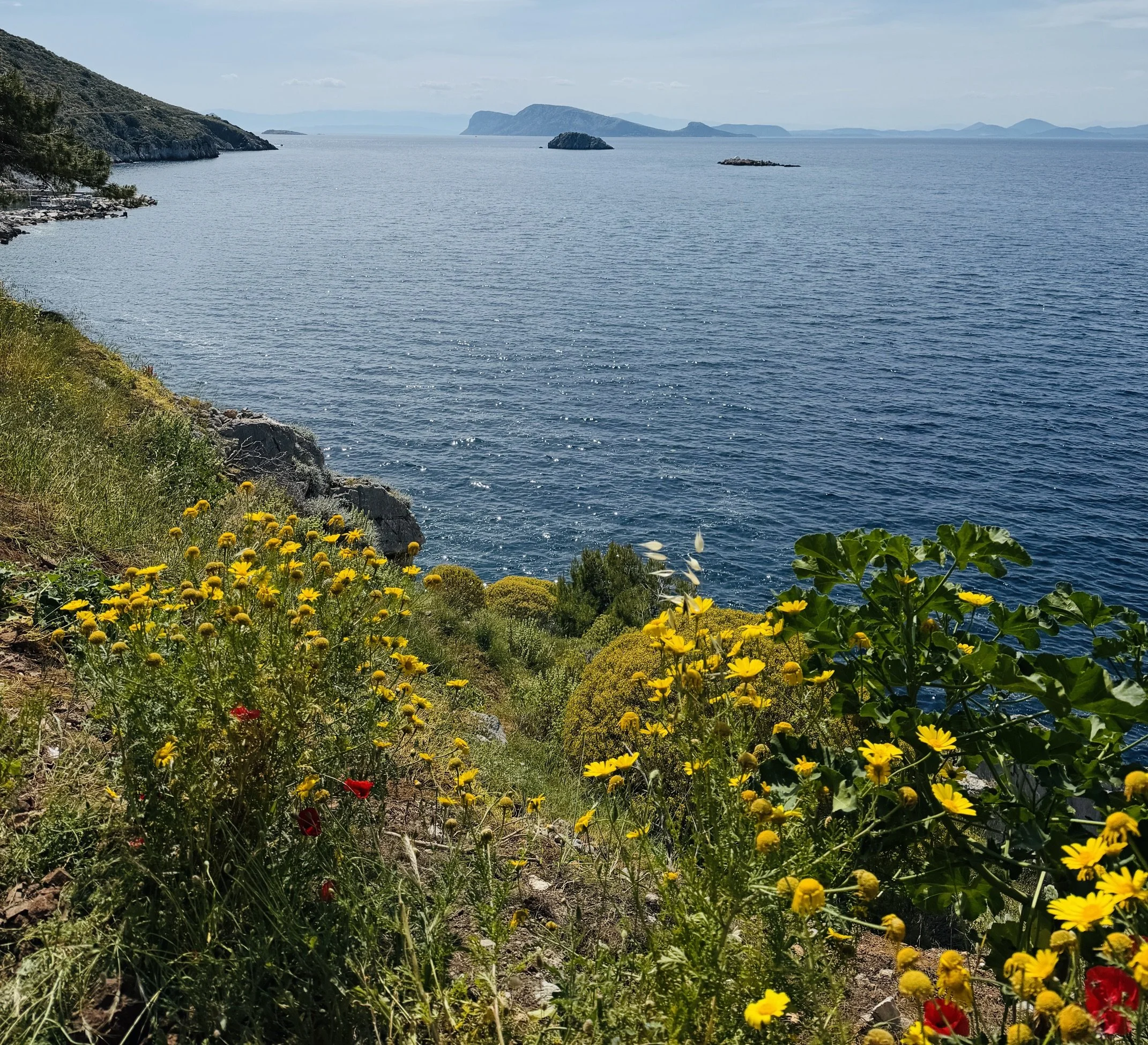
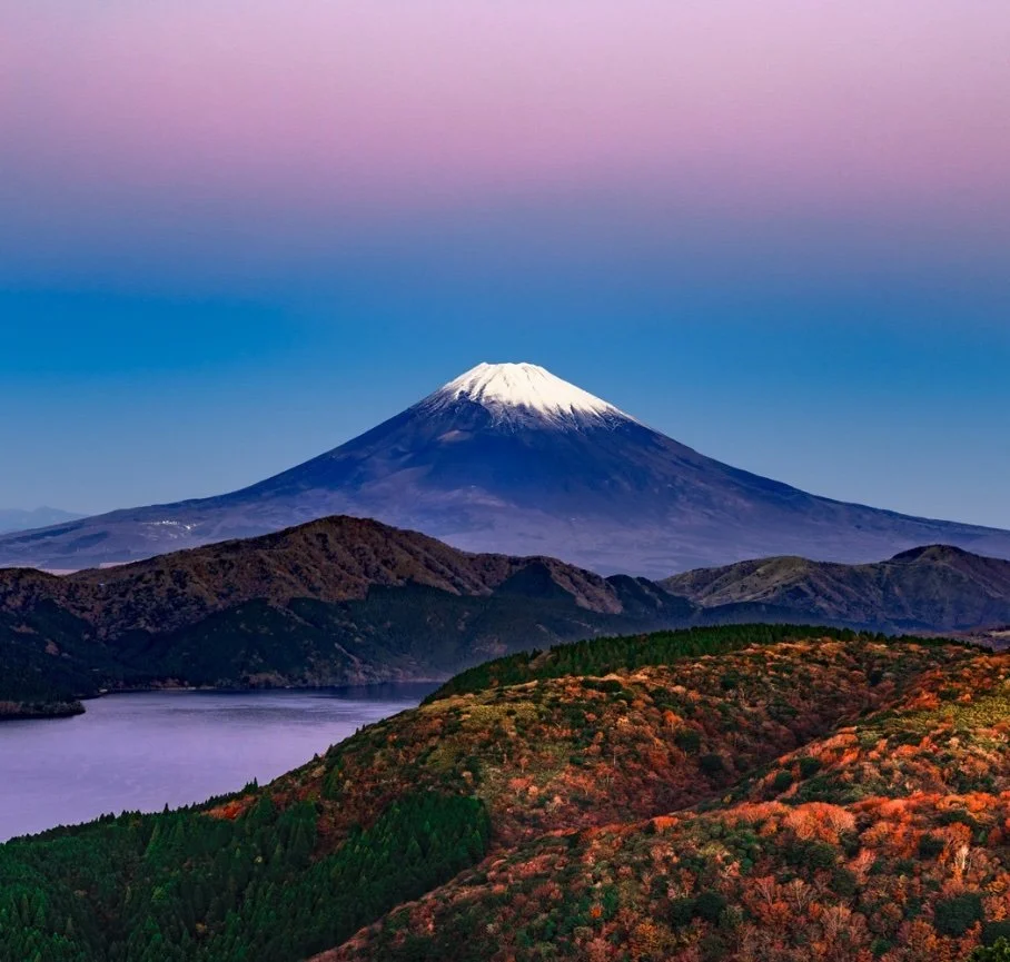
view of the Pelopenese
5. curated eye
No exhibitions this week. Simply views of Hydra and beyond.
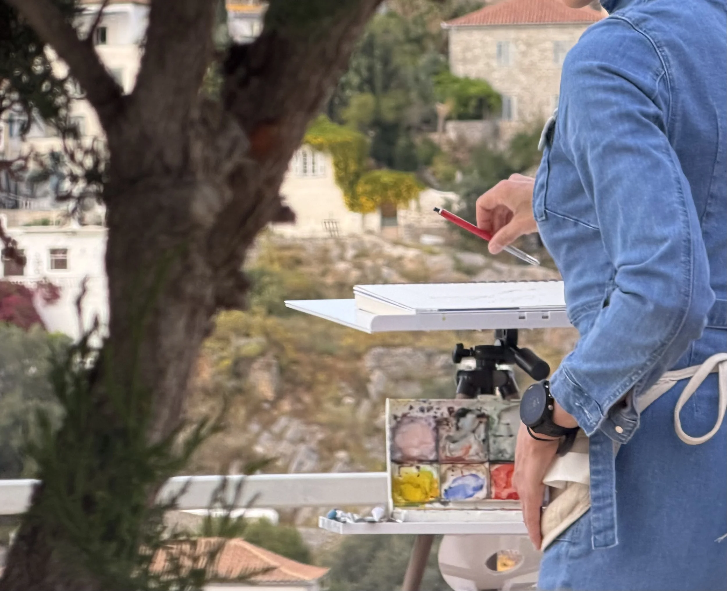
plein air
6. infj
I’ve never been a fan of plein air painting, but this is the first time I have a watercolor easel. It only weighs 2kg, and the parts fit perfectly in my painting bag. I brought a lot of supplies from Brooklyn, including a cup for water. Brushes, a pan set, gouache, cloth, lead holder and sketchbook are all proving essential, but the watercolor pencils and crayons are not. Glad I am typing this. I will leave them behind from now on.